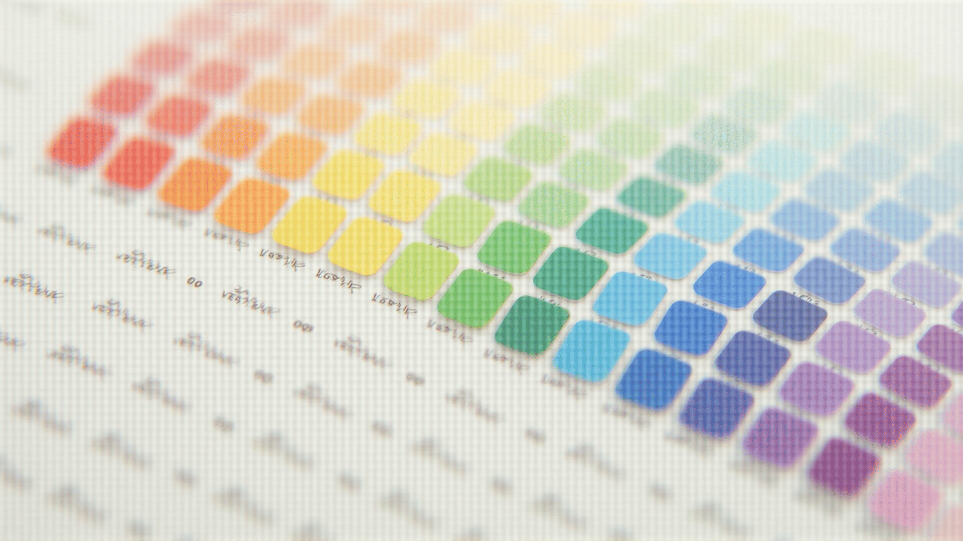
Color plays a crucial role in shaping perceptions and interactions within digital spaces. The art and science of understanding and utilizing colors effectively can significantly enhance the user experience, making digital environments not only aesthetically pleasing but also functional.
The psychology behind color is foundational in crafting digital designs. Colors evoke emotional responses and can influence how information is consumed. For example, cool hues like blues and greens often convey calmness and serenity, while warm tones like reds and yellows can instill a sense of urgency or excitement. Understanding these color associations can help creators evoke the desired emotional response and guide user behavior.
Cultural interpretations of color also affect user perception. In some cultures, white signifies purity and calm, while in others, it's the color of mourning. It's crucial for creators to consider the target audience's cultural background to use colors appropriately and avoid unintended interpretations.
In addition to emotional and cultural considerations, color contrast is vital for accessibility. Ensuring sufficient contrast between text and background allows for readability by users with visual impairments. This inclusivity not only expands the reach of a digital presence but demonstrates a commitment to providing a universal experience.
Color harmony also plays a role in user engagement. Harmonious color schemes can create a sense of balance and attract users' attention without overwhelming them. Complementary colors or analogous color schemes often work well to create a visually appealing and coherent look.
In digital interfaces, the use of consistent color schemes helps create an intuitive experience. Users are able to navigate with ease as their eyes find familiar patterns, enhancing usability. This consistency fosters trust and can improve user retention and satisfaction.
Beyond aesthetics, color affects conversion and interaction rates. Strategic use of contrasting colors can draw attention to crucial buttons and links, guiding users toward specific actions. By highlighting elements like call-to-action buttons in a distinct color, creators can effectively direct user paths and enhance interaction efficacy.
Color is not a superficial aspect of digital design; it is a potent tool that can influence emotions, improve accessibility, and guide user behavior. Applying a thoughtful approach to color selection, with consideration of psychological, cultural, and practical aspects, can dramatically enhance digital experiences. Whether striving for aesthetic allure or functional clarity, mastering digital color theory is essential in creating appealing and effective digital environments.
