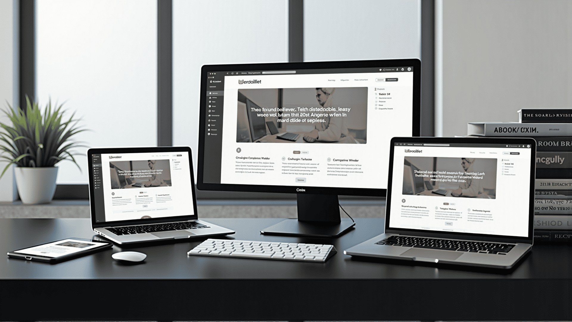
In today's digital landscape, designing adaptable websites is more important than ever. People access the internet from a wide range of devices, including smartphones, tablets, laptops, and desktops, each with varying screen sizes and capabilities. Learning how to create flexible designs ensures that your website looks stunning and performs optimally no matter how it is accessed.
The core of adaptable webpage design lies in providing an optimal viewing experience—easy reading and navigation with a minimum of resizing, panning, and scrolling—across a wide range of devices. This is achieved through a combination of flexible layouts, images, and the use of cascading style sheets (CSS) media queries.
The first step in creating an adaptable design is understanding flexible grids. A grid-based layout allows for content to expand and contract as necessary to fit the screen size. This approach uses percentages or em units rather than fixed units like pixels, allowing text and layout elements to adjust based on the user's specific screen dimensions.
In addition to grids, images must also be flexible. This can be achieved by setting the maximum width of an image to 100% within the CSS. This ensures that images scale down when necessary but don’t expand beyond their natural size, which could result in pixelation.
Media queries are another essential tool. They allow developers to apply different CSS rules at different device widths, letting you customize the look and feel of a site based on user preferences or screen capabilities. Media queries can be used to alter the layout of content, modify font sizes, or control the visibility of elements depending on the device being used.
Interactive elements, such as menus and buttons, should also be designed with adaptability in mind. Navigation should be straightforward whether accessed via mouse or touch inputs. This often involves designing larger click areas for touchscreens, making navigation easier for the user.
Responsive design also enhances accessibility. By adhering to good adaptive design principles, you can ensure that your site is usable by as many people as possible, including individuals with disabilities who may depend on screen readers or other assistive technologies.
Performance optimization is another critical component of adaptable design. Ensuring your site loads quickly on all devices not only enhances the user experience but also can improve your site's search engine rankings. Techniques such as compressing images, leveraging browser caching, and minifying CSS and JavaScript can greatly improve performance.
It’s also helpful to continually test your design across different devices and browsers. This proactive approach identifies potential issues that can affect user experience. Using various online tools and platforms enables developers to see how their designs function in different environments, fostering continuous improvement.
Finally, the design process should always keep the user in mind. Prioritize a seamless user experience, ensuring that content is easily accessible, regardless of the mode of entry. A coherent visual hierarchy, thoughtful typography, and considering the use of whitespace can make a significant difference in how users engage with your content.
By embracing these adaptable design principles, you empower your website to provide a consistent and enjoyable experience, meeting the needs of both the site owner and its users effectively. The focus on functionality, beauty, and accessibility paves the way for a powerful online presence in a rapidly evolving digital world.